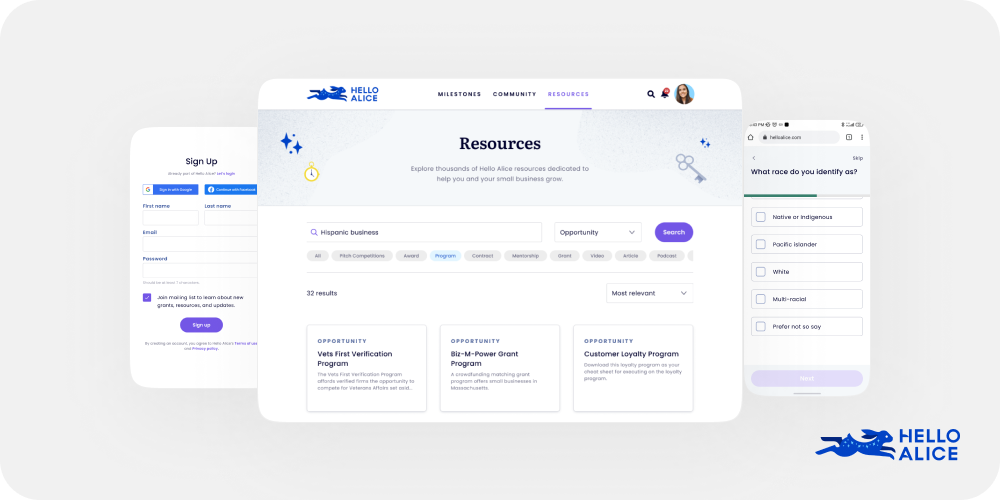

Hello Alice is a platform designed for small business owners to access resources, grant opportunities, and community support. To meet WCAG 2.1 web accessibility standards and provide a universally usable experience, Hello Alice needed a comprehensive UX/UI overhaul.
My role involved translating user needs into end-to-end easy-to-use experiences. I provided wireframes, prototypes, high-fidelity mockups, and conducted a detailed Design QA process. This involved constant communication with developers, project managers, directors, and other stakeholders.
Hello Alice faced issues with inefficient resource delivery, a lack of web accessibility practices, and was undergoing a rebrand. The platform needed a mobile-first app that adhered to WCAG standards, improved navigation, and met conflicting timelines.
The primary target audience comprised small business owners from marginalized communities, including LGBTQ+ individuals, Black communities, and women, who required access to funding and educational resources to support their business ventures.
A small team of product designers quickly turned the new brand into an easy-to-use design system, reworking all existing pages and improving the UX on the fly.
Updated the UI to align with the new design system, focusing on accessibility and visual appeal.

Low engagement with the existing search tool, which lacked necessary filters and sorting options.
Implemented a global search and filter tool, allowing users to search and filter by categories and subcategories. Added a sort option to organize content based on relevancy or date added.
Created a simple and clean global search tool, improving the ease of finding resources.

The existing onboarding process was not mobile-friendly and had too many steps, making it hard for users to complete.
Designed a mobile-first onboarding process with fewer questions, keeping it simple and accessible.
Improved the onboarding experience, making it more user-friendly and accessible.

The content team needed efficient tools to create and edit resources.
Developed a resource dashboard and builder, allowing the content team to create, edit, filter, sort, and perform bulk actions on resources.
Provided the content team with powerful tools to manage resources efficiently.

Established a Design Quality Assurance process focused on accessibility, screen-reader and keyboard compatibility, correct usage of reusable components, and responsiveness.
Ensured that the final product met design and accessibility standards through thorough QA and detailed documentation via Jira tickets for developers and project managers.

The redesign of Hello Alice successfully transformed the platform into an accessible, mobile-first app that met WCAG 2.1 standards. The updated UI aligned with the new design system, providing a cohesive and visually appealing experience. Key improvements, such as the global search and filter tool, a streamlined onboarding process, and enhanced content management tools, significantly improved user engagement and usability. The Design QA process ensured that all features met accessibility criteria and worked as intended. Positive feedback from users and stakeholders highlighted the effectiveness of the redesign in making the platform easier to navigate and more accessible.
Let's talk
If you’re working on a complex product and need a designer who can take it from ambiguity to delivery, I’m open to conversations.
soyandresgar@gmail.com
Based in Colombia. Working remotely